

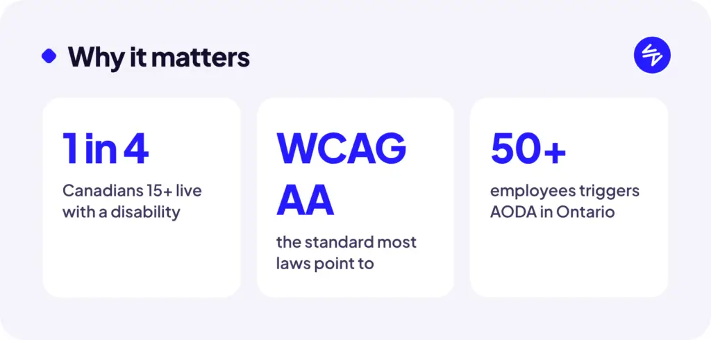
Roughly one in four Canadians aged 15 and over lives with a disability, according to Statistics Canada. That includes people who are blind or have low vision, people who can’t use a mouse, people with hearing loss, and people with cognitive disabilities. Add in aging eyes, a cracked phone screen, or bright sunlight on a patio, and “accessibility” covers a lot of your customers.
If your website is hard for them to use, they leave. Accessibility is good business before it’s anything else.
Do the laws apply to you?
Here’s the short version (this isn’t legal advice, so check with a professional for your situation):
- Ontario (AODA): Private and non-profit organizations in Ontario with 50 or more employees must meet the WCAG 2.0 Level AA standard on their websites.
- Federal (Accessible Canada Act): Applies to federally regulated organizations like banks, telecom, and interprovincial transportation, with digital requirements phasing in over the next few years.
- Other provinces: Manitoba, Nova Scotia, B.C. and others have their own accessibility laws at various stages. Alberta doesn’t have a dedicated provincial accessibility law for business websites as of this writing.
- Selling into the U.S.? Website accessibility lawsuits under the ADA are common there, and they’ve been filed against businesses of all sizes.
Even if no law applies to you today, the standard everyone points to is the same: WCAG (the Web Content Accessibility Guidelines). Building toward it now is far cheaper than retrofitting later.
The practical checklist
You don’t need to become an expert. Start with these. They cover the problems that show up on almost every site we audit.
Images and media
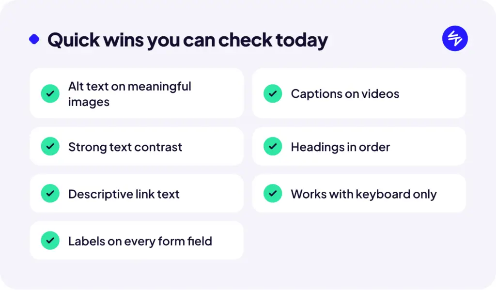
- Every meaningful image has alt text that describes what it shows (decorative images can have empty alt text)
- Videos have captions
- Nothing important is only shown as text baked into an image
Colour and readability
- Text has enough contrast against its background (light grey text on white is the most common failure we see)
- Colour isn’t the only way information is shown (like red text for errors, with no icon or message)
- Text can be zoomed to 200% without breaking the layout
Navigation and structure
- Headings are used in order (H1, then H2, then H3), not just picked for their size
- Links say where they go (“View our pricing,” not “Click here”)
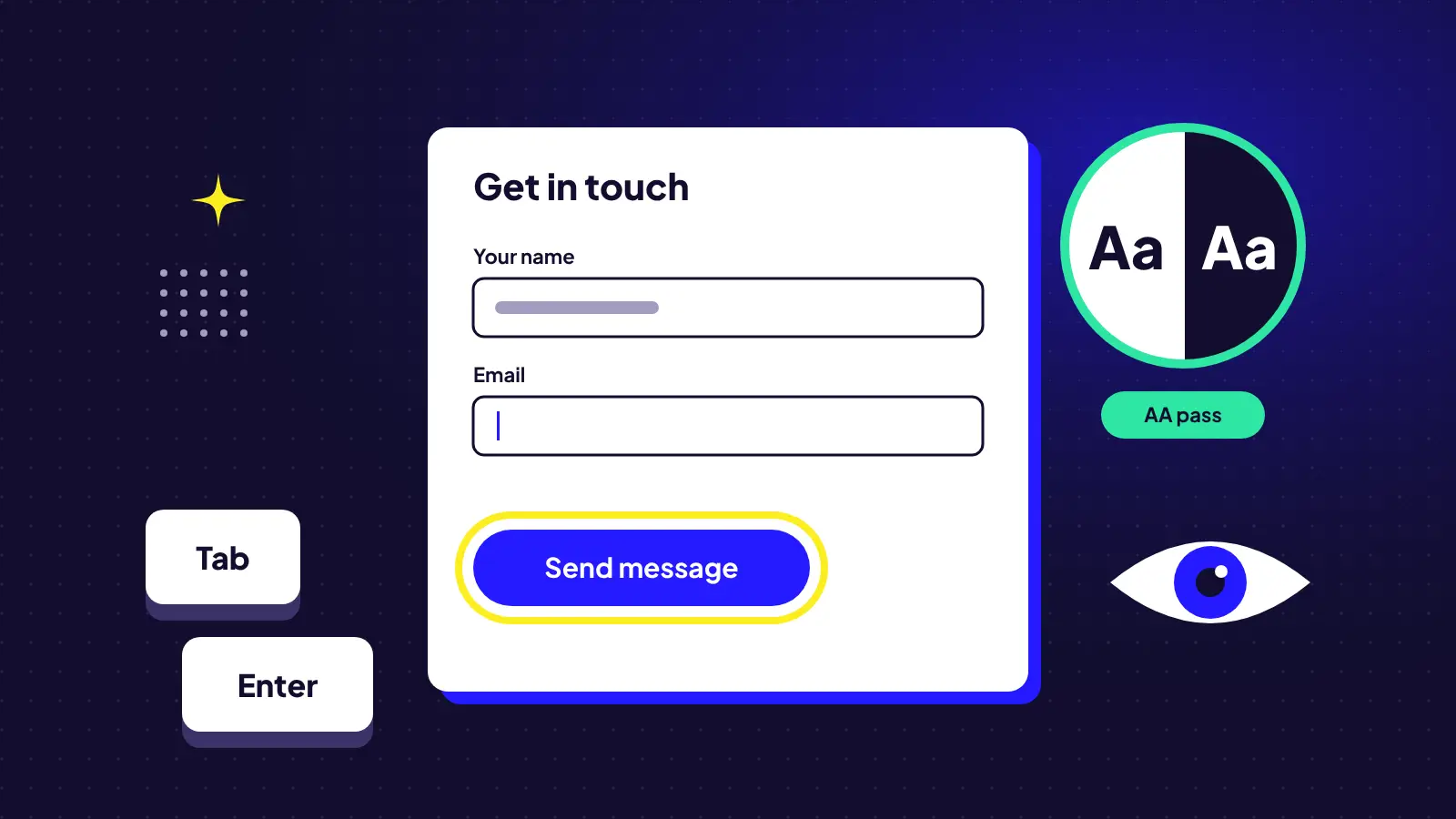
- The whole site can be used with just a keyboard, with a visible focus outline as you tab around
Forms
- Every field has a visible label, not just placeholder text that disappears
- Error messages explain what went wrong and how to fix it
- No CAPTCHA puzzles without an accessible alternative
A 10-minute self test
Try this on your own site:
- Unplug your mouse. Can you get through your main pages and submit your contact form using only the Tab and Enter keys?
- Zoom to 200%. Does everything still fit and make sense?
- Run a free checker. Tools like WAVE or Google Lighthouse (built into Chrome) will flag the obvious issues in seconds.
What about accessibility overlay widgets?
You’ve probably seen plugins that promise one-click compliance. They can help with a few things, but they don’t fix the underlying code, and they’ve been criticized by many accessibility advocates. Treat them as a supplement, not a solution.
Want a proper review?
We can audit your site against WCAG and give you a prioritized list of fixes, starting with the ones that make the biggest difference for real users.