


Look at your website, your last social post, your business card, and the last flyer you made. Do they look like they came from the same company?
For most small businesses, the honest answer is “sort of.” The logo is stretched on one, the blue is a slightly different blue on another, and someone used Comic Sans on the event poster. It happens. But it quietly makes your business look less established than it is.
A brand style guide fixes this. And no, you don’t need a 60-page brand book. You need one page.
What goes in a mini style guide
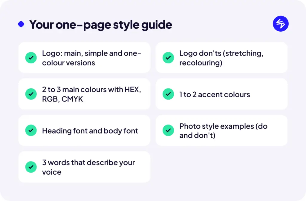
1. Your logo, and how not to use it
Include your main logo, a simplified version (for small spaces like social avatars), and a one-colour version for dark or busy backgrounds. Then add a few “don’ts”: don’t stretch it, don’t change the colours, don’t put it on a busy photo without a backing shape.
Save each version as a PNG (for everyday use) and an SVG (for your designer and website). Put them in one shared folder everyone can find.
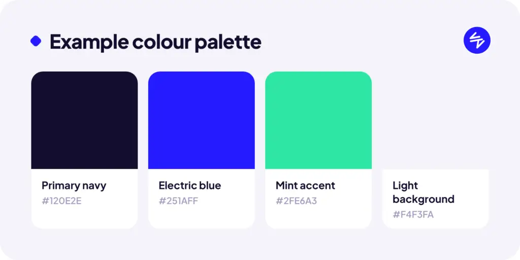
2. Your colours, with the actual codes
Pick two or three main colours and one or two accents. Write down the codes for each:
- HEX for web (like #251AFF)
- RGB for screens and social tools
- CMYK for print
This is the single biggest consistency win. “Our blue” means nothing to a printer. A HEX code means everything.
3. Your fonts (two is plenty)
One font for headings, one for body text. That’s it. Write down the exact names and where to get them. If your brand font isn’t available in tools like Canva or Google Docs, list a close fallback so people aren’t guessing.
4. Your photo and graphic style
A few example images that feel right for your brand, and a few that don’t. Bright and candid or dark and moody? Real team photos or illustrations? This saves you from a random mix of stock photos that don’t belong together.
5. Your voice in a few words
How do you sound? Pick three words and a short “we are / we aren’t” list. For example: friendly but not goofy, confident but not salesy, plain-spoken, never jargon-heavy. Add a sample sentence or two so people can hear it.
How to actually use it
A style guide only works if people use it. A few tips:
- Make it a PDF and a shared folder. The PDF is the reference, the folder holds the logo files.
- Load it into your tools. Canva Pro lets you save a Brand Kit with your colours, fonts and logos. Do it once and everyone on your team has it.
- Send it to every vendor. Printers, sign shops, freelancers, your web designer. It saves them time and saves you from reprints.
Need help pulling it together?
If your brand has drifted over the years, or you never had a proper set of logo files to begin with, we can help you tidy it up and build a guide you’ll actually use.