

If you run a hotel, resort, or golf course, you already know the math. Online travel agencies (OTAs) like Expedia and Booking.com bring in guests, but they take a meaningful cut of every booking, often somewhere in the 15 to 25 percent range.
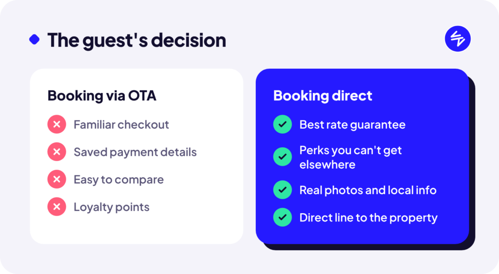
Here’s the thing most operators miss: a lot of guests find you on an OTA, then go look at your website before they book. They want to see the real photos, check the details, and maybe find a better deal. If your site makes that hard, they head right back to the OTA and book there.
Your website’s job is to make booking direct the obvious choice.
7 fixes that move the needle
1. Put the booking button everywhere
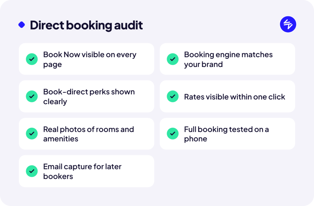
Your “Book Now” button should be visible on every page, including on mobile where it should stay pinned to the screen as guests scroll. If someone has to hunt for it, you’ve already lost some of them.
2. Make the booking engine feel like part of your site
A lot of properties send guests off to a booking engine that looks nothing like their website. Different colours, different fonts, a different URL. It feels like a bait and switch and kills trust right at the moment of payment. Most booking engines can be styled to match. Do it.
3. Give them a reason to book direct
Guests need a reason to skip the OTA they already trust. Spell it out clearly, ideally right next to the booking widget:
- Best rate guaranteed when you book with us
- Free late checkout, a welcome drink, or a tee time perk
- Flexible cancellation that OTAs don’t offer
Even a small perk works, as long as it’s easy to see.
4. Show prices early
Guests who can’t see a rate will go somewhere that shows one. If your site requires three clicks before showing a price, that’s three chances for them to leave.
5. Use real photos, and lots of them
Professional photos of your actual rooms, views, course, and amenities do more than any copy ever will. Stock images of generic smiling couples make guests suspicious. Show them exactly what they’re getting.
6. Fix your mobile experience
Most travel research happens on phones. Test your own booking flow on your phone, start to finish. If it’s slow, fiddly, or the date picker is a nightmare, guests will give up and use the OTA app they already have.
7. Capture the ones who aren’t ready yet
Not everyone books on the first visit. Offer something worth an email address (a seasonal deal, an events calendar, a golf package) so you can bring them back directly instead of paying a commission to win them again.
OTAs aren’t the enemy
You probably shouldn’t drop the OTAs entirely. They’re a powerful way to be discovered, especially by first-time guests. The goal is balance: let the OTAs introduce you, then let your website win the booking, and the repeat visit after that.
Want a second set of eyes?
We’ve worked with resort and golf properties on exactly this. If you’d like a quick review of your booking path, get in touch and we’ll tell you where guests are slipping away.